|
Note: Originally written in February 2015
There's a theme in design that calls for the use of negative spaces. It basically suggests to use all the white backgrounds of a webpage effectively to accentuate the black and colored graphics on top. I think this movie takes this concept and applies it across the board - the frames, the visuals, the soundscapes and the emotions. The frames intersperse black and white blank spaces with objects, the visuals are nudity interspersed with worldly objects, the soundscapes have a lot of silence interspersed between mellow music, the emotions are unsaid amidst idyllic banter about life, war, art and other poignant philosophies. Each of these juxtapositions only subtly uplift the movie to a finely appreciable superlative. Maybe the theme isn't just a design adage but applies to Cinema as well and more so; to life. Catch more on the flick at IMDB and Letterboxd.
0 Comments
Leave a Reply. |
Read MoreAtlantic City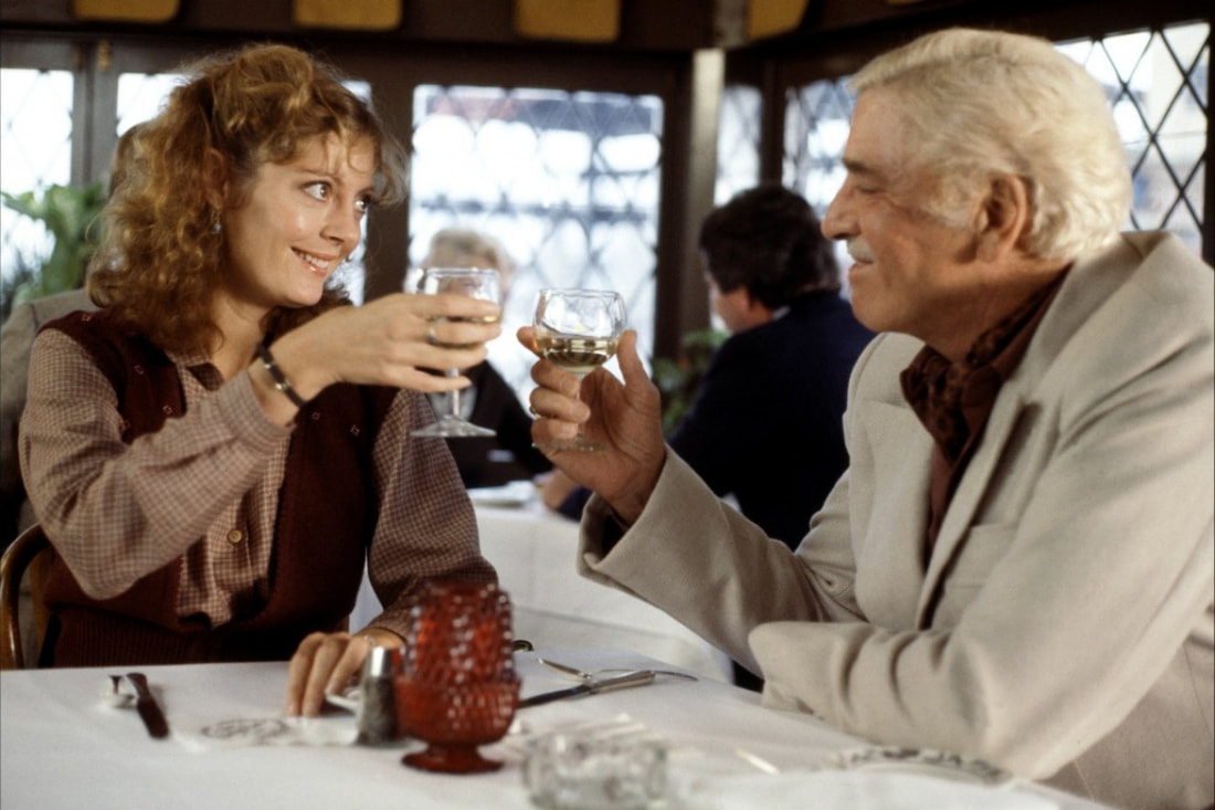
Atlantic City says so much about two people in a relationship, without saying too much.
Booksmart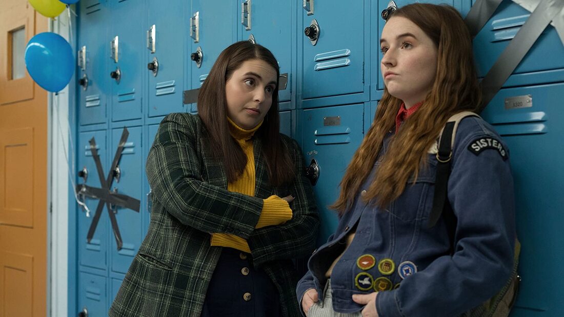
A comedy that is fun, while being just good cinema in the first place.
Categories
All
|